Bubble Excel Chart

Speichern, ausfüllen, drucken, fertig!
How to design a bubble chart? How to create a Bubble Chart? How to Use a Bubble Chart?Download this Bubble Chart template now!
Verfügbare Gratis-Dateiformate:
.pdf- Dieses Dokument wurde von einem Professional zertifiziert
- 100% anpassbar
Business Unternehmen data Angaben Tool Werkzeug Chart Diagramm Charts Diagramme Bubble Blase Excel Chart Excel Diagramm
How to design a Bubble Chart? What is a Bubble Chart?
A Bubble Chart is a type of data visualization that displays three dimensions of data. Each point in the chart is represented by a bubble, where the position on the x-axis and y-axis corresponds to two dimensions of the data, and the size of the bubble represents the third dimension. Bubble charts are particularly useful for displaying and comparing the relationships between the data points when you want to visualize the influence of a third variable.
How to Read a Bubble Chart?
Axes: The x-axis (horizontal) and y-axis (vertical) represent two dimensions of the data. The specific variables plotted on each axis depend on the data set.
Bubbles: Each bubble on the chart represents a data point. The position of the bubble on the x and y axes shows the values of the first two dimensions.
Size: The size of each bubble corresponds to the value of the third dimension. Larger bubbles indicate higher values, while smaller bubbles indicate lower values.
Color: Sometimes, the bubbles are also color-coded to represent a fourth dimension, adding another layer of information.
How to Use a Bubble Chart?
Identify Relationships: Use bubble charts to identify relationships between three variables. For example, in business, you might plot revenue on the x-axis, profit on the y-axis, and the size of the bubble could represent the market share.
Compare Data Points: Quickly compare different data points to see which ones stand out due to their position and bubble size.
Highlight Outliers: Identify outliers that do not fit the general pattern of the data, which might require further investigation.
Trend Analysis: Observe trends and patterns within the data set. For instance, a cluster of bubbles in a particular area of the chart might indicate a common characteristic among those data points.
Example Usage
Imagine a company wants to analyze its product portfolio. They can create a bubble chart where:
- The x-axis represents the sales revenue of each product.
- The y-axis represents the profit margin.
- The size of the bubble represents the market share of each product.
- The color of the bubbles could represent different product categories.
By analyzing the chart, the company can identify which products generate high revenue and profit, which ones have a significant market share, and how different product categories are performing relative to each other.
Bubble charts are a powerful visualization tool for displaying complex relationships between three or more dimensions of data. By effectively using and interpreting bubble charts, you can gain valuable insights into your data, make informed decisions, and communicate findings more clearly.
Download this Bubble Excel Chart template now for your own benefit!
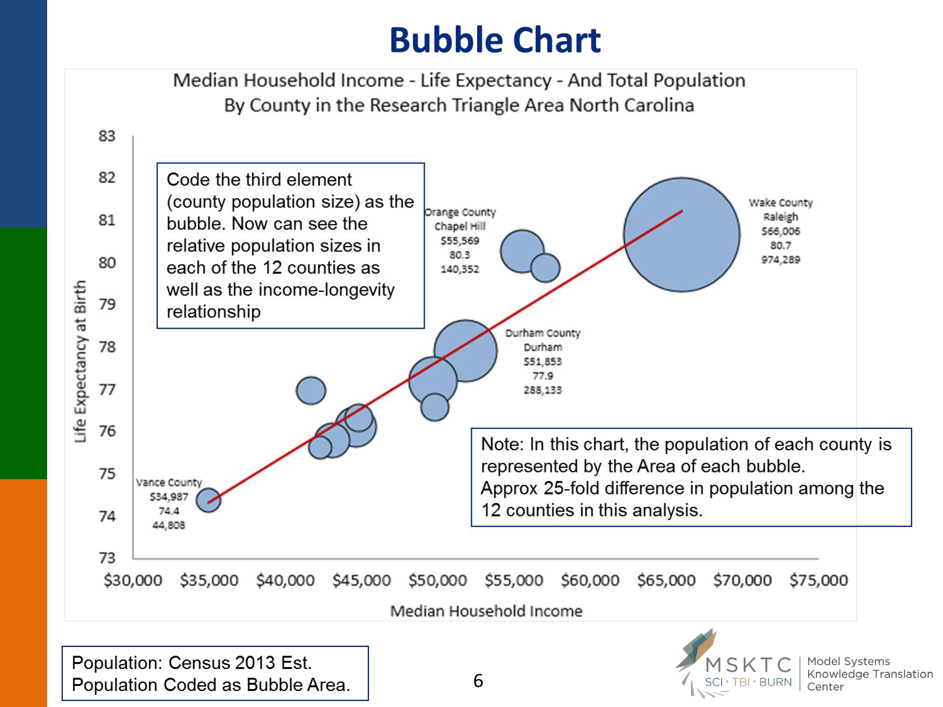
If you wished to also express the population size of each county etc on the same chart, you could proportionally enlarge or shrink each plotted data point in the form of a bubble (counties with larger populations would have larger bubbles on the XY Scatter plot) – so as to simultaneously highlight the relationship between income and life expectancy, but also to highlight where the largest populations live within this relationship..
HAFTUNGSAUSSCHLUSS
Nichts auf dieser Website gilt als Rechtsberatung und kein Mandatsverhältnis wird hergestellt.
Wenn Sie Fragen oder Anmerkungen haben, können Sie sie gerne unten veröffentlichen.
